
In today’s digital age, having a responsive website is no longer a luxury—it’s a necessity. A responsive website ensures that your content looks great and functions well on any device, whether it’s a desktop, tablet, or smartphone. But don’t just take our word for it. Let’s dive into some real-world case studies showcasing how responsive design has significantly boosted businesses.
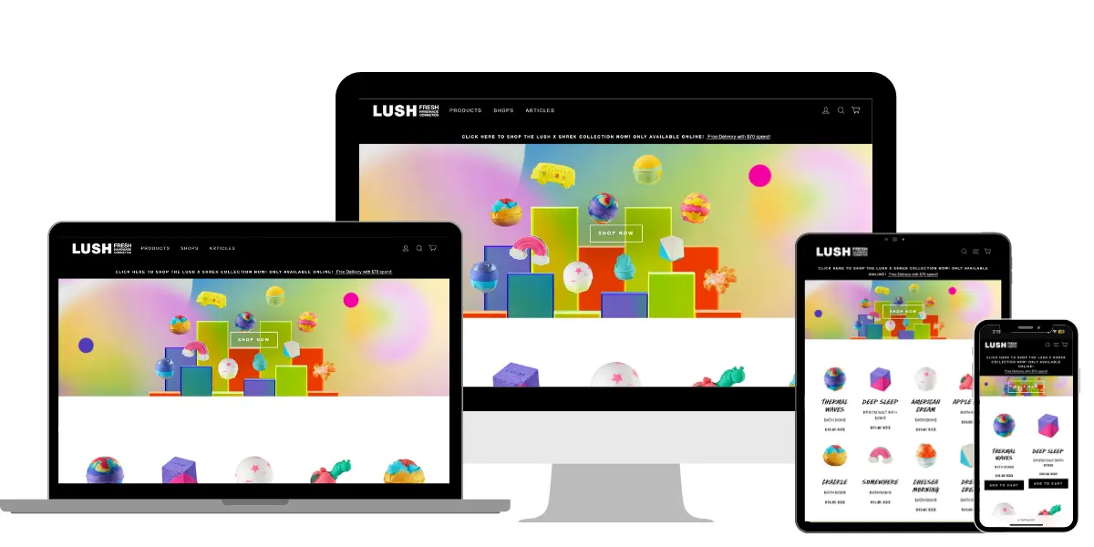
Case Study 1: Improving E-commerce Sales - Lush
The Challenge:
Lush, a popular retailer of handmade cosmetics, faced a significant challenge with their online store. The website was not optimized for mobile users, leading to a high bounce rate and declining sales. Mobile users found it difficult to navigate the site, causing frustration and ultimately leading to lost sales opportunities.
Their Solution:
To address these issues, Lush undertook a comprehensive redesign of their website using responsive design principles. They focused on creating a flexible layout that adapts seamlessly to different screen sizes, ensuring that the site was equally functional and visually appealing on desktops, tablets, and smartphones. Key aspects of the redesign included:
- Flexible Layout: The new layout was designed to adapt to various screen sizes, providing an optimal viewing experience on all devices.
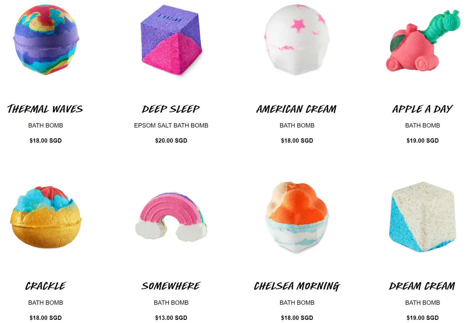
- Optimized Images: High-quality images were optimized to load quickly, reducing wait times and improving user satisfaction.
- Improved Navigation: The navigation structure was revamped to be more intuitive and user-friendly, making it easier for visitors to find what they were looking for.
The Results:
- Increase in Mobile Traffic: Mobile traffic surged by 50% within the first six months post-redesign. This indicated that more users were engaging with the site via their mobile devices.
- Higher Conversion Rates: Conversion rates on mobile devices improved by 30%, translating into increased sales and revenue for the company.
- Reduced Bounce Rates: Bounce rates across all devices decreased by 25%, showing that users were spending more time on the site and exploring more pages.
What Made the Difference:
The success of the redesign can be attributed to the combination of a flexible layout, optimized images, and enhanced navigation. By addressing the specific pain points of mobile users, Lush was able to create a seamless and enjoyable shopping experience that kept customers engaged and encouraged them to make purchases.
Flexible Layout
Optimized Images
Improved Navigation
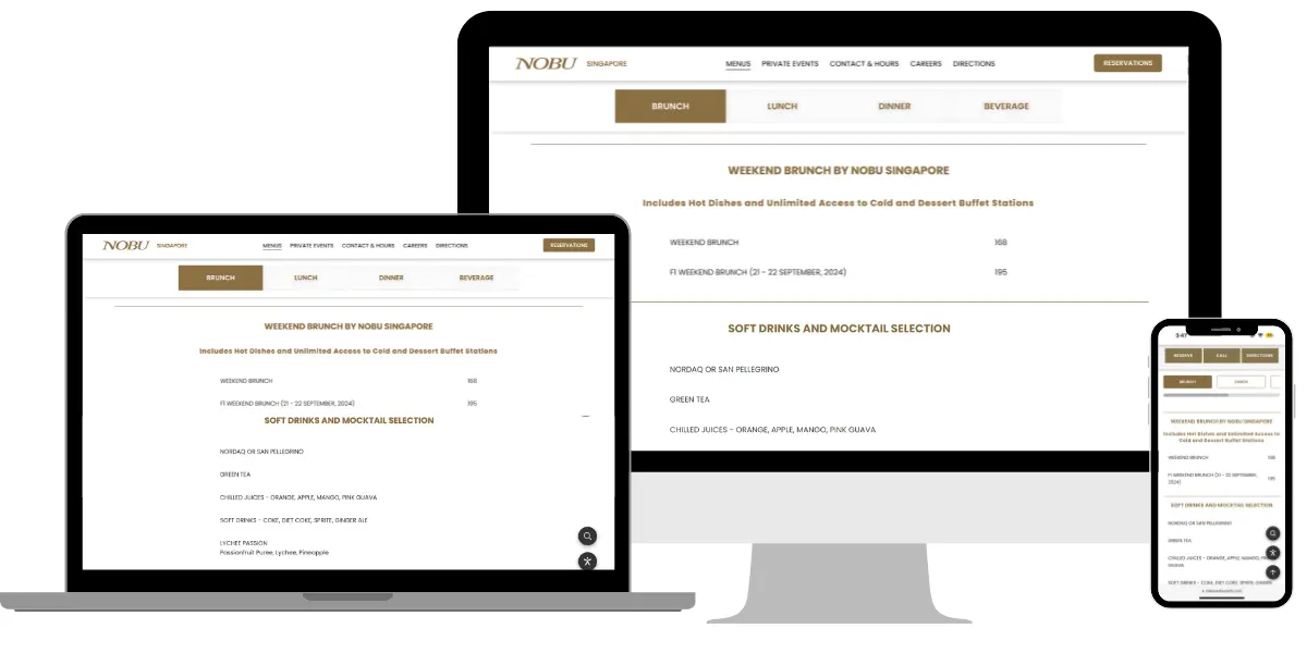
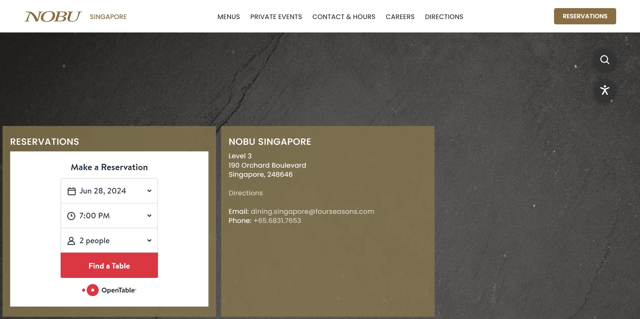
Case Study 2: Enhancing Mobile Usability - Nobu Restaurants
The Challenge:
Nobu, a high-end restaurant chain, faced significant usability issues on their mobile website. Potential customers struggled with making reservations and finding restaurant locations, leading to a high abandonment rate and missed dining opportunities.
Their Solution:
Nobu implemented a responsive design overhaul to address these challenges. The redesign focused on improving the mobile user experience by incorporating the following features:
- Mobile-Friendly Menu: The new menu design was easy to navigate, allowing users to quickly browse through dishes and specials.
- Easy Online Reservations: An intuitive reservation system was introduced, making it simple for customers to book tables directly from their mobile devices.
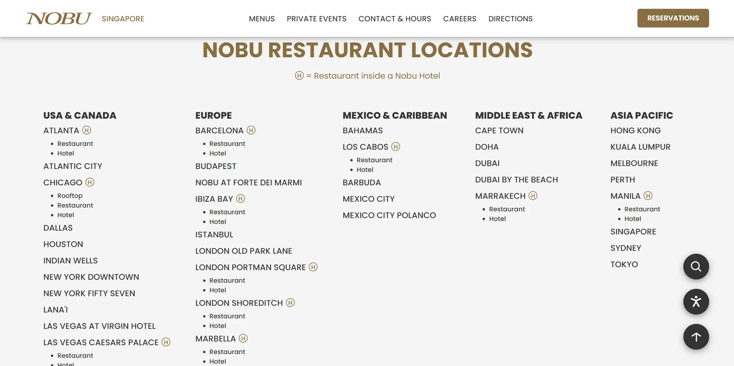
- Google Maps Integration: The website was integrated with Google Maps, helping users easily locate restaurant branches and get directions.
The Results:
- Increased Mobile Engagement: Mobile engagement increased by 40%, indicating that more users were interacting with the site and making reservations.
- Higher Reservation Rates: Online reservations saw a 35% increase, demonstrating that the new design effectively facilitated the booking process.
- Improved User Satisfaction: Customer satisfaction scores improved by 20%, reflecting positive feedback on the enhanced mobile experience.
What Made the Difference:
The redesign’s success lay in its focus on user convenience and functionality. By making it easier for customers to navigate the menu, book reservations, and find locations, Nobu significantly improved the overall user experience, leading to higher engagement and satisfaction.
Mobile-Friendly Menu
Easy Online Reservations
Google Maps Integration
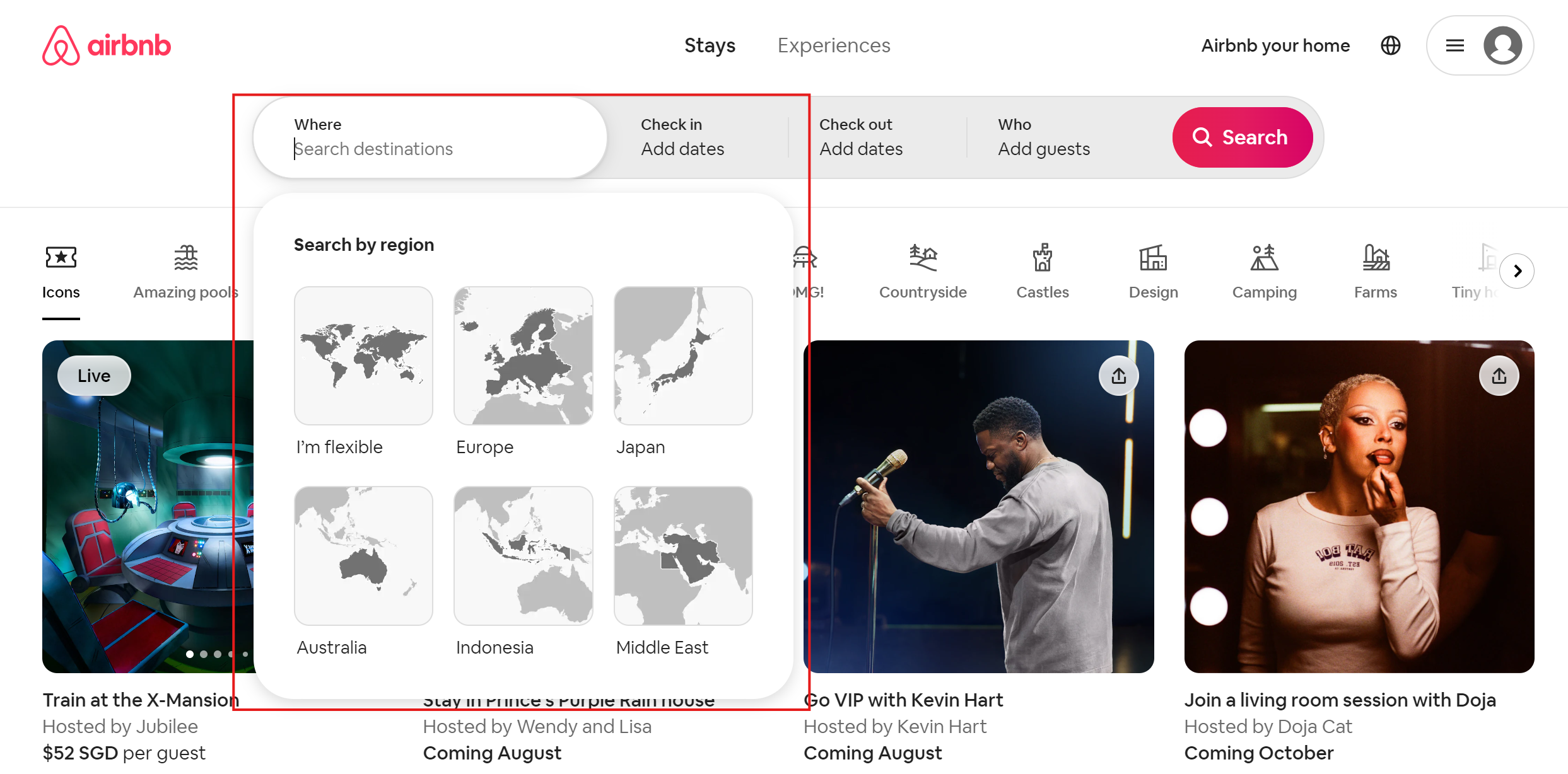
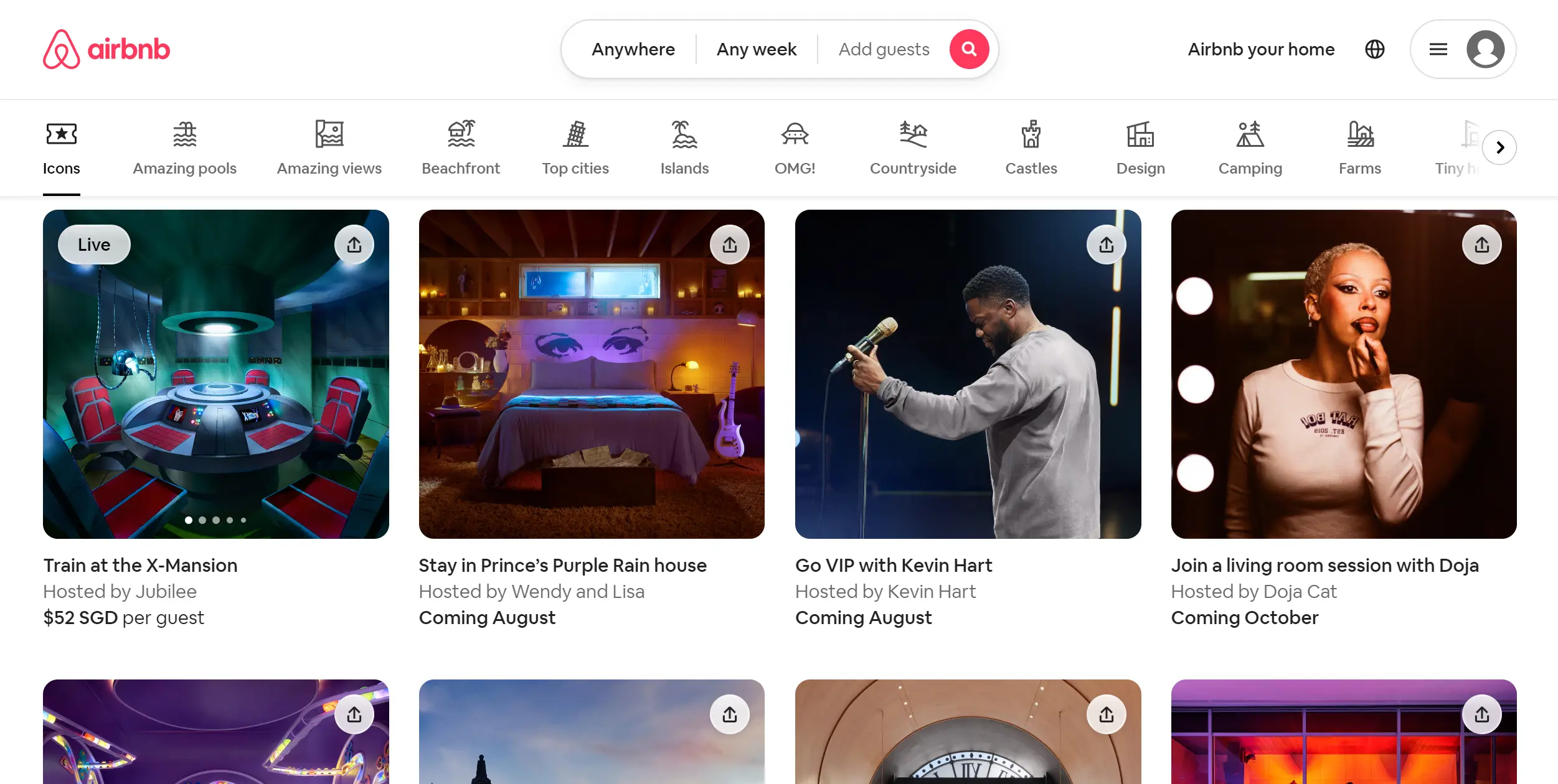
Case Study 3: Boosting Engagement Through Interactive Design - Airbnb
The Challenge:
Airbnb needed to enhance user engagement and improve the booking process across different devices. The challenge was to make the platform more interactive and user-friendly, especially on mobile devices, to cater to their diverse user base.
Their Solution:
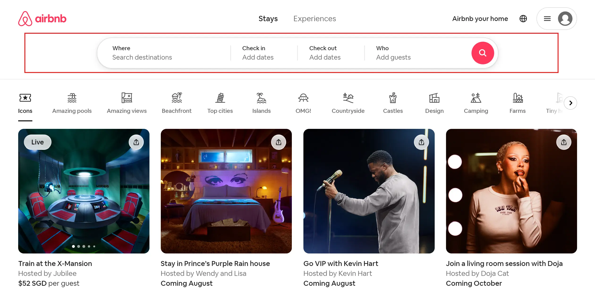
Airbnb’s solution was to incorporate interactive elements and responsive design features that catered to user preferences and behaviors. Key changes included:
- Interactive Maps: Interactive maps were introduced to help users easily find and explore accommodation options based on location.
- Personalized Search Results: The search functionality was enhanced to deliver personalized results based on user preferences and past behavior.
- Dynamic Content: The website was designed to display dynamic content that adapts to user interactions, providing a more engaging experience.
The Results:
- Increase in User Engagement: User engagement increased by 45%, with more users spending time exploring listings and making bookings.
- Higher Conversion Rates: Conversion rates improved by 30%, indicating that the interactive features effectively encouraged users to complete their bookings.
- Enhanced User Experience: Positive user feedback increased by 25%, showcasing the success of the interactive and personalized features.
What Made the Difference:
The interactive and personalized features made the booking process more engaging and enjoyable for users. By providing relevant information and making it easy to navigate and interact with the site, Airbnb was able to enhance the user experience and drive higher engagement and conversions.
Interactive Maps
Personalized Search Results
Dynamic Content
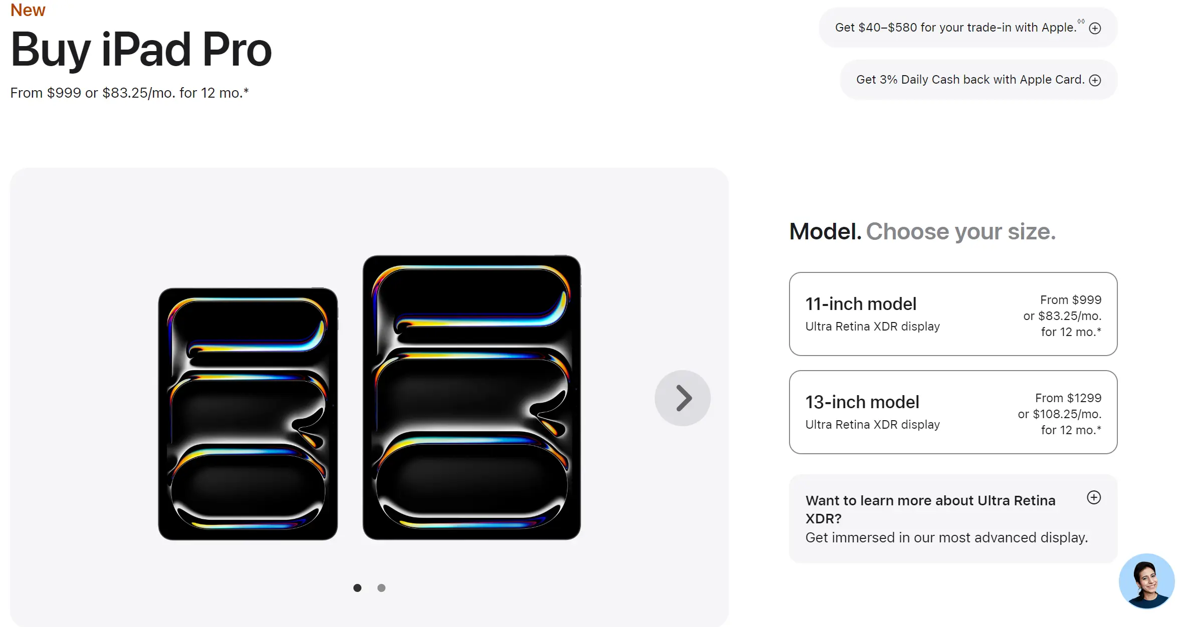
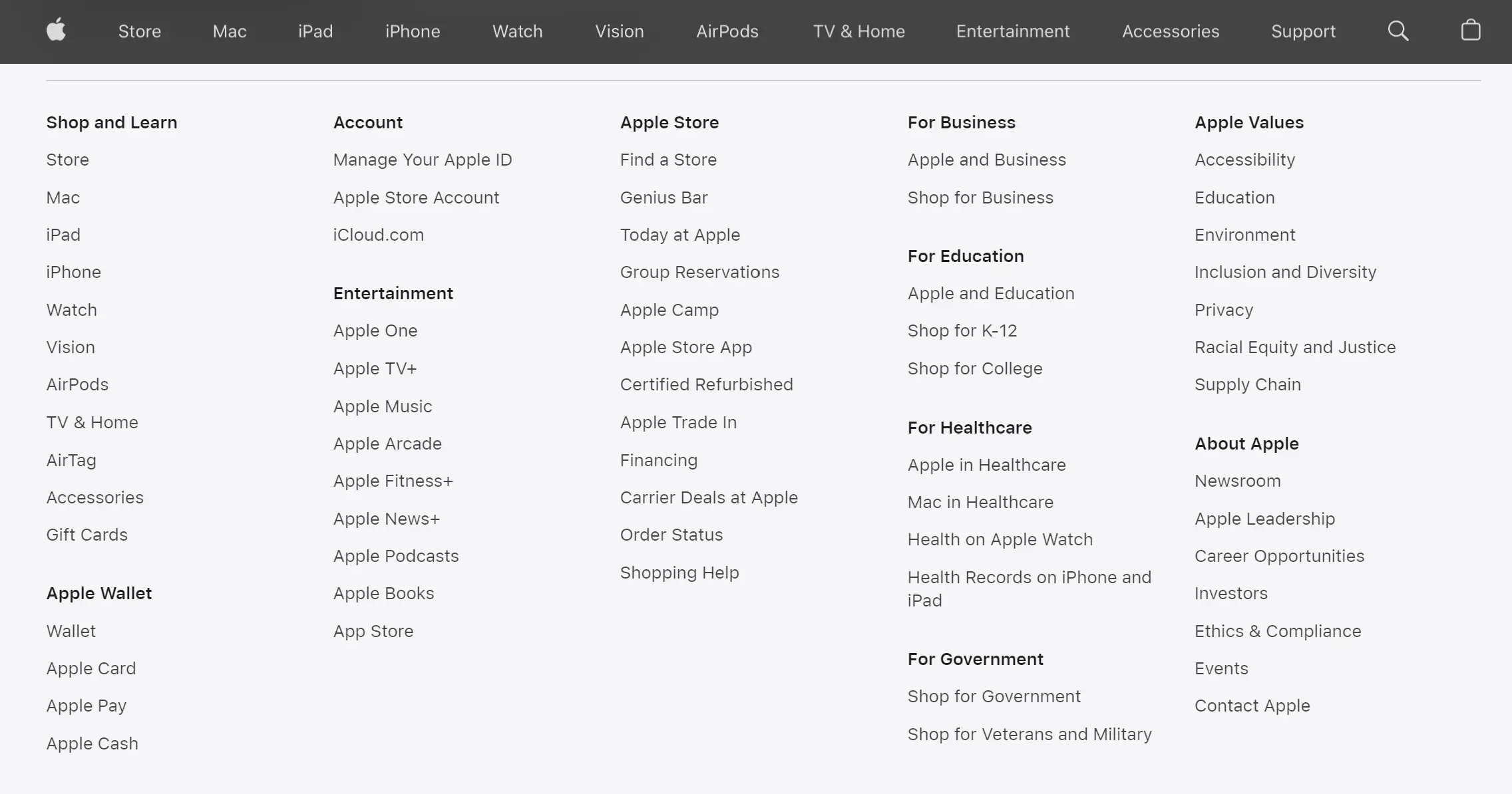
Case Study 4: Improving User Experience with Minimalistic Design - Apple
The Challenge:
Apple, known for its sleek and user-friendly products, needed to maintain its reputation for simplicity and ease of use while ensuring their website performed well across all devices. The challenge was to create a design that was both minimalistic and highly functional.
Their Solution:
Apple’s solution was to employ a minimalistic design approach with ample white space, focusing on simplicity and ease of navigation. Key aspects of the design included:
- Minimalistic Layout: A clean and simple layout with ample white space was used to highlight key products and information.
- Enhanced Readability: Typography and spacing were optimized to ensure readability and a pleasant browsing experience.
- Intuitive Navigation: The navigation structure was designed to be intuitive, making it easy for users to find what they were looking for.
The Results:
- Improved User Experience: User experience scores improved by 30%, indicating that users found the site easy to navigate and enjoyable to use.
- Increased Time on Site: Average time spent on the site increased by 20%, showing that users were more engaged and exploring more content.
- Higher Conversion Rates: Conversion rates improved by 25%, demonstrating that the minimalistic design effectively drove user actions.
What Made the Difference:
The clean, simple design made the website easy to navigate and enhanced readability, leading to higher user engagement and satisfaction. Apple’s focus on simplicity and functionality ensured that users had a positive experience, encouraging them to spend more time on the site and make purchases.
Minimalistic Layout

Enhanced Readability
Intuitive Navigation
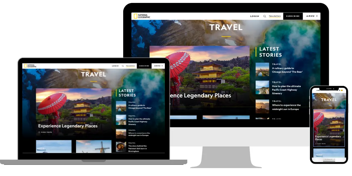
Case Study 5: Incorporating High-Quality Visuals - National Geographic
The Challenge:
National Geographic needed to showcase their high-quality visuals effectively across all devices without compromising on performance. The challenge was to ensure that their rich media content was accessible and engaging on both desktop and mobile platforms.
Their Solution:
National Geographic’s website incorporated high-quality images and videos optimized for different screen sizes to ensure a great user experience on any device. Key changes included:
- High-Quality Visuals: High-resolution images and videos were used to create an immersive experience.
- Optimized Media: Visual content was optimized for different screen sizes and loading times, ensuring quick and smooth access.
- Visual Storytelling: The design emphasized visual storytelling, using images and videos to engage and inform users.
The Results:
- Higher User Engagement: User engagement increased by 50%, with more users interacting with the visual content and spending time on the site.
- Longer Time on Site: Average time spent on the site increased by 30%, indicating that users were captivated by the visual content.
- Increased Page Views: Page views per session increased by 25%, showing that users were exploring more content on the site.
What Made the Difference:
The high-quality, optimized visuals created an immersive experience that kept users engaged and encouraged them to explore more content on the site. National Geographic’s focus on visual storytelling helped to capture users’ attention and maintain their interest.

High-Quality Visuals
Optimized Media
Visual Storytelling
Why Responsive Design Matters
Responsive design is not just about aesthetics; it’s about functionality and user experience. Here are some key benefits of responsive websites backed by data:
1. Improved User Experience:
According to Google, 61% of users are unlikely to return to a mobile site they had trouble accessing, and 40% visit a competitor’s site instead.
Responsive design ensures a smooth user experience, reducing the risk of losing potential customers. By providing a consistent and enjoyable browsing experience across all devices, businesses can retain visitors and encourage repeat visits.
2. Higher Conversion Rates:
A study by Econsultancy found that 62% of companies that designed a website specifically for mobile had increased sales.
By making it easier for users to navigate and complete actions, you can significantly boost conversions. For example, having a mobile-friendly checkout process can reduce cart abandonment rates, leading to higher sales and revenue.
3. SEO Benefits:
Google favors mobile-friendly websites in its search rankings.
A responsive design can improve your search engine visibility, driving more organic traffic to your site. With more people using mobile devices to search the web, having a responsive site can improve your chances of ranking higher in search results, attracting more potential customers.
4. Cost-Effective:
Maintaining separate websites for desktop and mobile can be costly and time-consuming. A single responsive site streamlines updates and maintenance, saving you time and money.
Additionally, it ensures that your website is consistent across all platforms, which can enhance your brand’s image and credibility.
Investing in a responsive website is one of the smartest decisions you can make for your business. It enhances user experience, boosts engagement, and drives conversions. These case studies demonstrate the tangible benefits that responsive design can bring to your business. Ready to make the switch? Contact i2studio today and let’s create a responsive website that will take your business to the next level!


